Impact at a Glance
The Challenge
MDOT's MiSigns platform, used to manage road sign inventory and installation design across Michigan, was over 15 years old. Field engineers needed 1–2 full days to complete a single installation design, creating costly delays across the state's infrastructure programme.
"Engineers were spending 1–2 days on tasks that should take hours. Fragmented workflows, no responsive design, and poor usability between field and office teams created friction at every step."
- 12–18 disconnected workflow steps with no clear navigation structure
- Desktop-only, field engineers couldn't use the system on tablets in the field
- No real-time handoff between field teams and internal administrators
- High error rates due to unclear form design and missing input validation
- No accessibility compliance, excluded users relying on assistive technology
Before & After
Fragmented, desktop-only workflow requiring 1–2 days per installation design
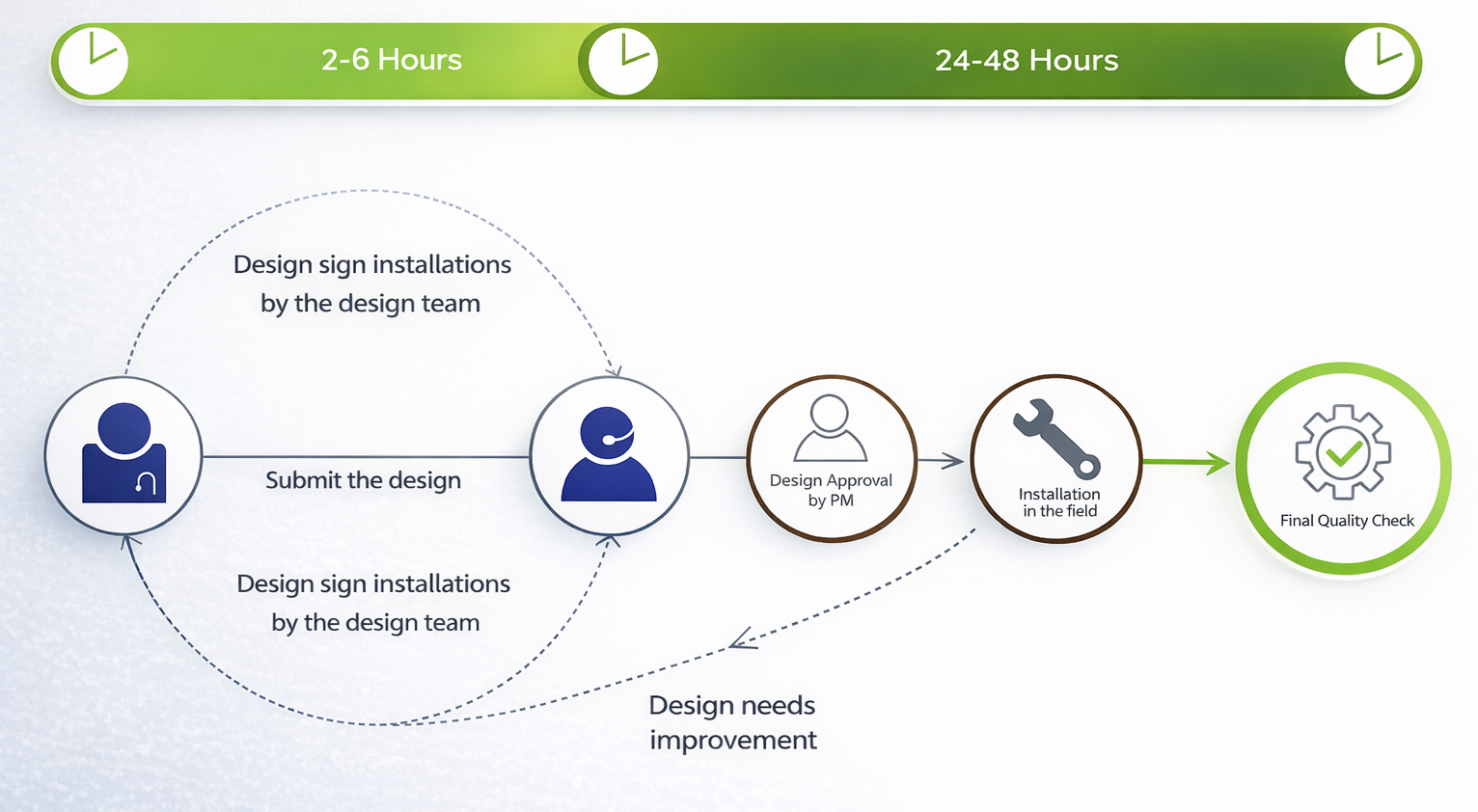
Streamlined, responsive design completing the same task in hours
Installation Task Flow
Redesigned the entire task architecture, consolidating 12+ fragmented steps into a guided, linear workflow with clear decision points and progress visibility.
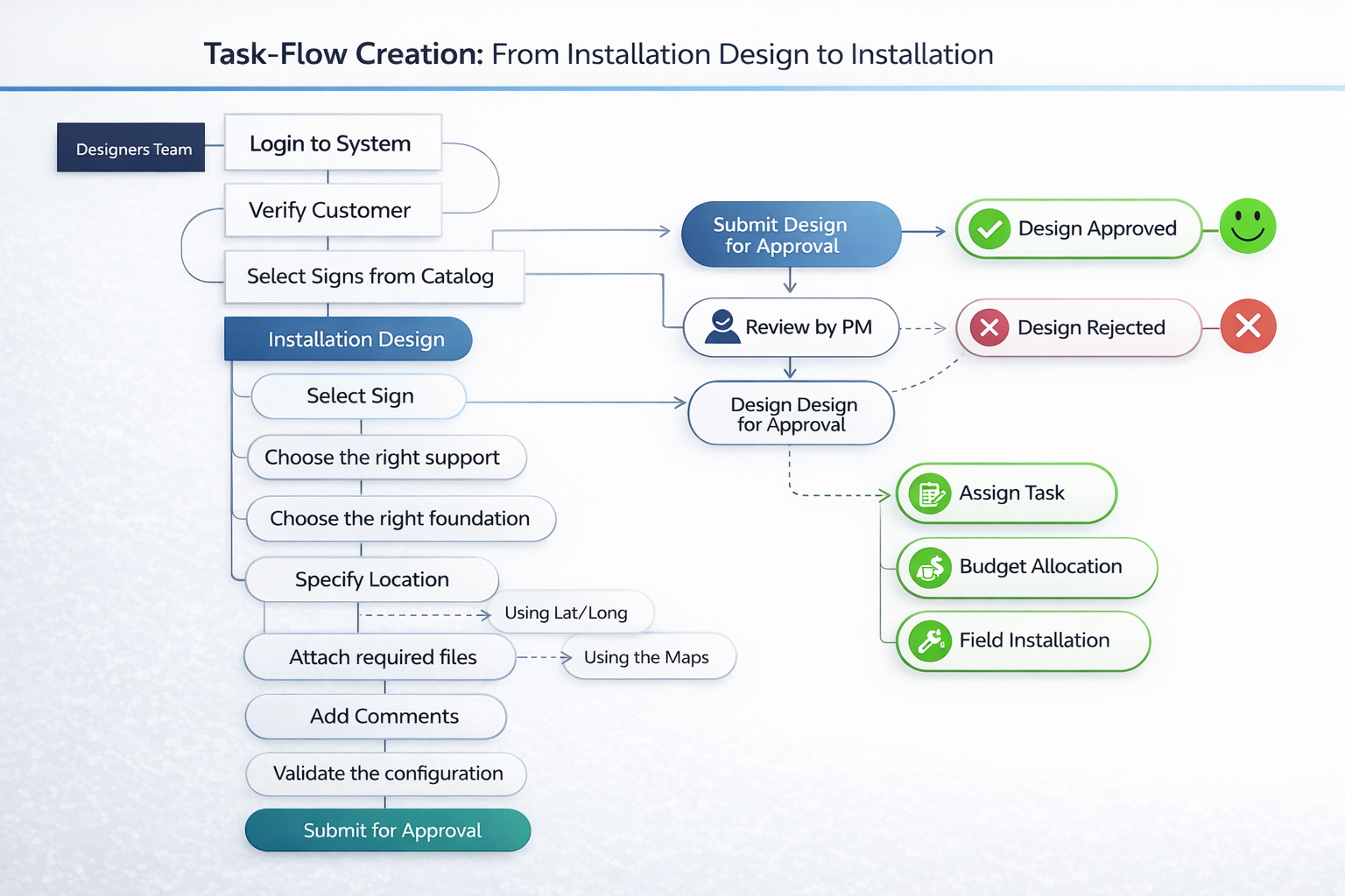
Refined Design Iteration
After user testing, a second design iteration introduced smarter defaults, inline validation, and improved tablet layout for field use.
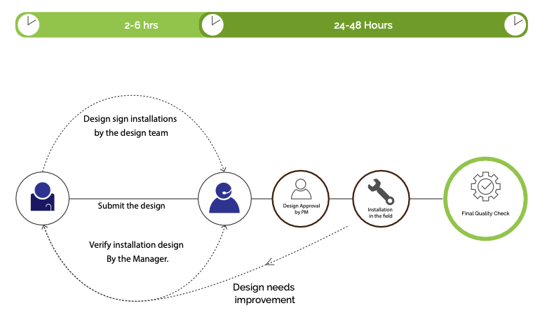
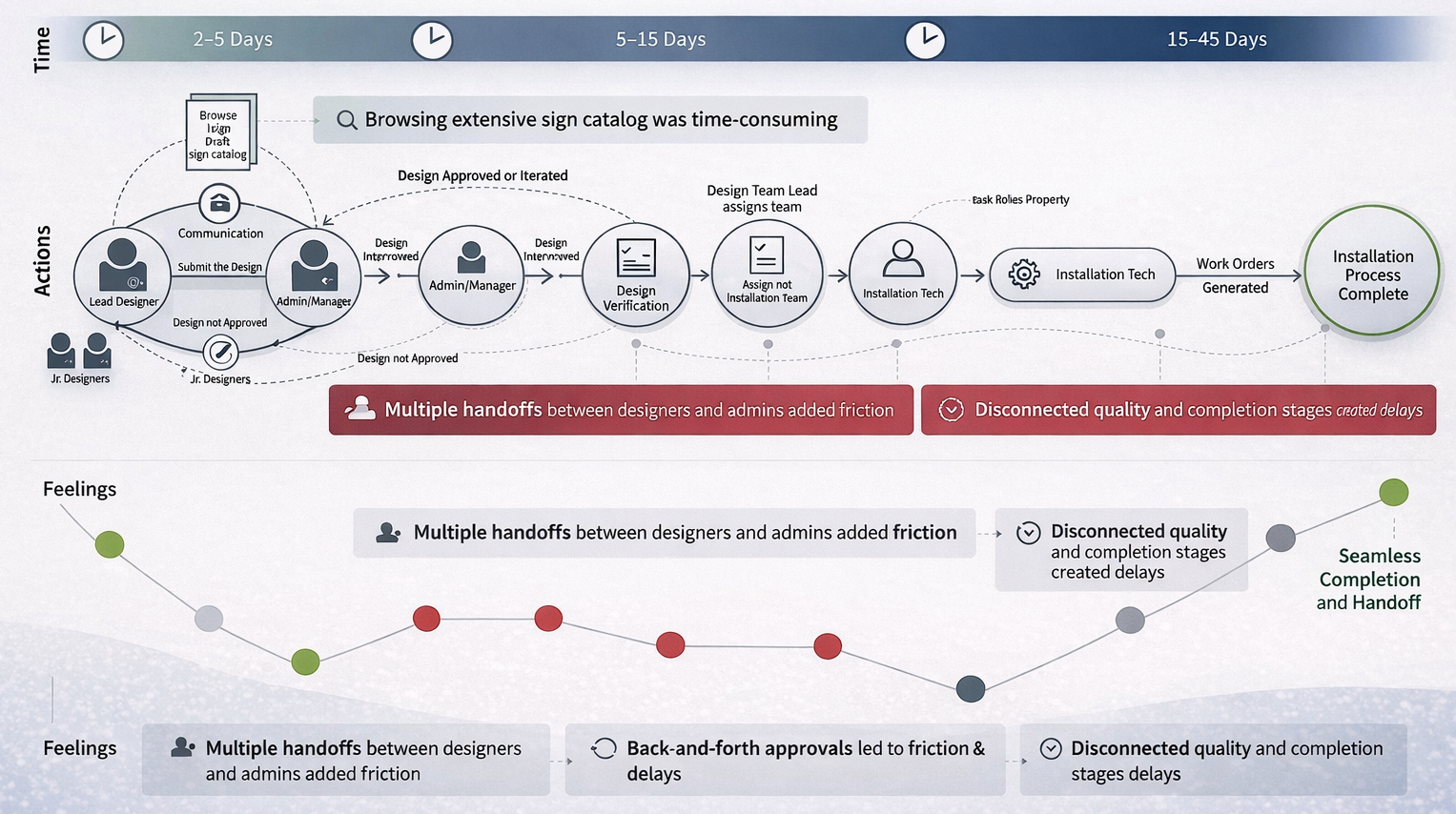
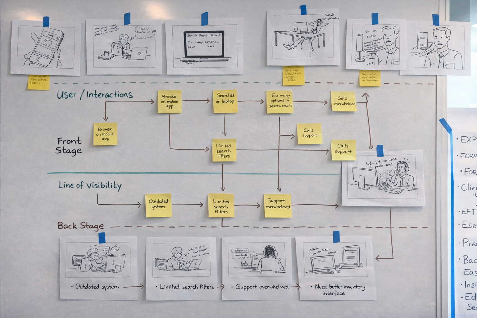
Service Blueprint
Mapped front-stage user actions to back-stage system processes, revealing where delays and handoff failures were occurring between field and office teams.
My Role
User Research
Contextual inquiry with field engineers. Stakeholder workshops with MDOT admins and IT leads.
Information Architecture
Rebuilt workflow structure around how engineers think, not around the database schema.
Responsive Design
Mobile-first architecture enabling field access on tablets, first time in the system's history.
Accessibility
WCAG 2.0 AA compliance audited with JAWS, NVDA, Axe, and WAVE across all modules.
Design Process
Research
Contextual inquiry, journey mapping, service blueprinting
Define
IA restructure, workflow consolidation, user flow redesign
Design
Wireframes → prototypes → usability testing → iteration
Deliver
Phased rollout, engineering handoff, WCAG audit
Key Takeaway
The 250% efficiency gain didn't come from better visual design, it came from understanding the workflow deeply enough to restructure it from the ground up. Research first, always.
Final production screens are protected under a state government NDA. Workflow diagrams and service blueprints above represent the UX architecture process.