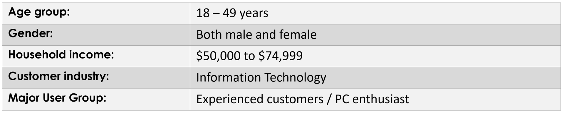
Overview
A university redesign project applying UX principles to improve an existing website. The process involved a structured heuristic evaluation, identification of key usability problems, and a full visual and interaction redesign focused on clarity, hierarchy, and user-friendliness.
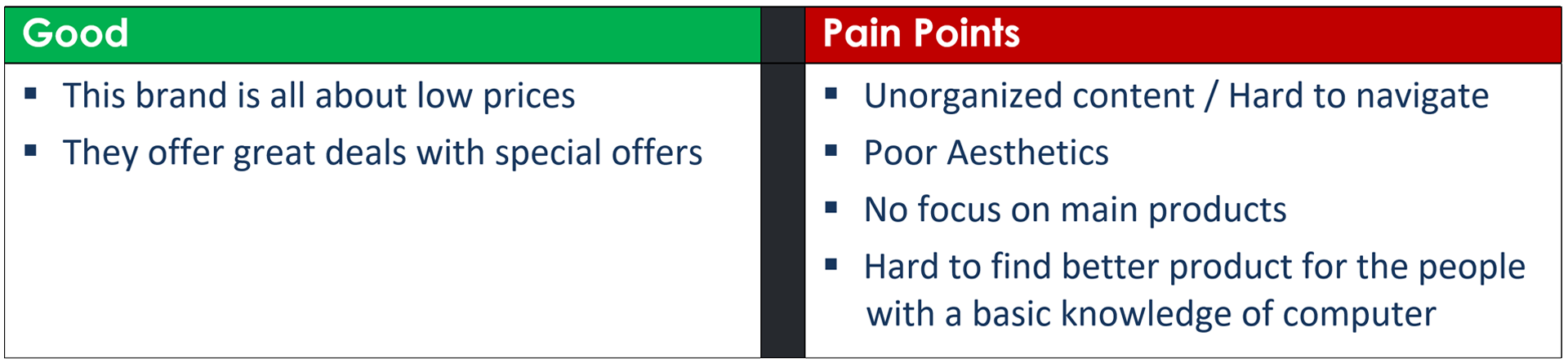
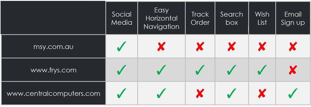
Problems Identified
- Cluttered layouts with no clear visual hierarchy, users couldn't identify primary actions
- Inconsistent typography and colour usage reducing readability
- Poor navigation structure making it hard to find key content
- No responsive design, the site was not usable on smaller screens
Before, Original Design
Original website, cluttered layout, weak hierarchy, poor scannability
After, Redesigned Experience
Redesigned, View 1
Simplified layout with clear visual hierarchy and consistent typography
Redesigned, View 2
Improved content structure and scannable sections
Responsive Design
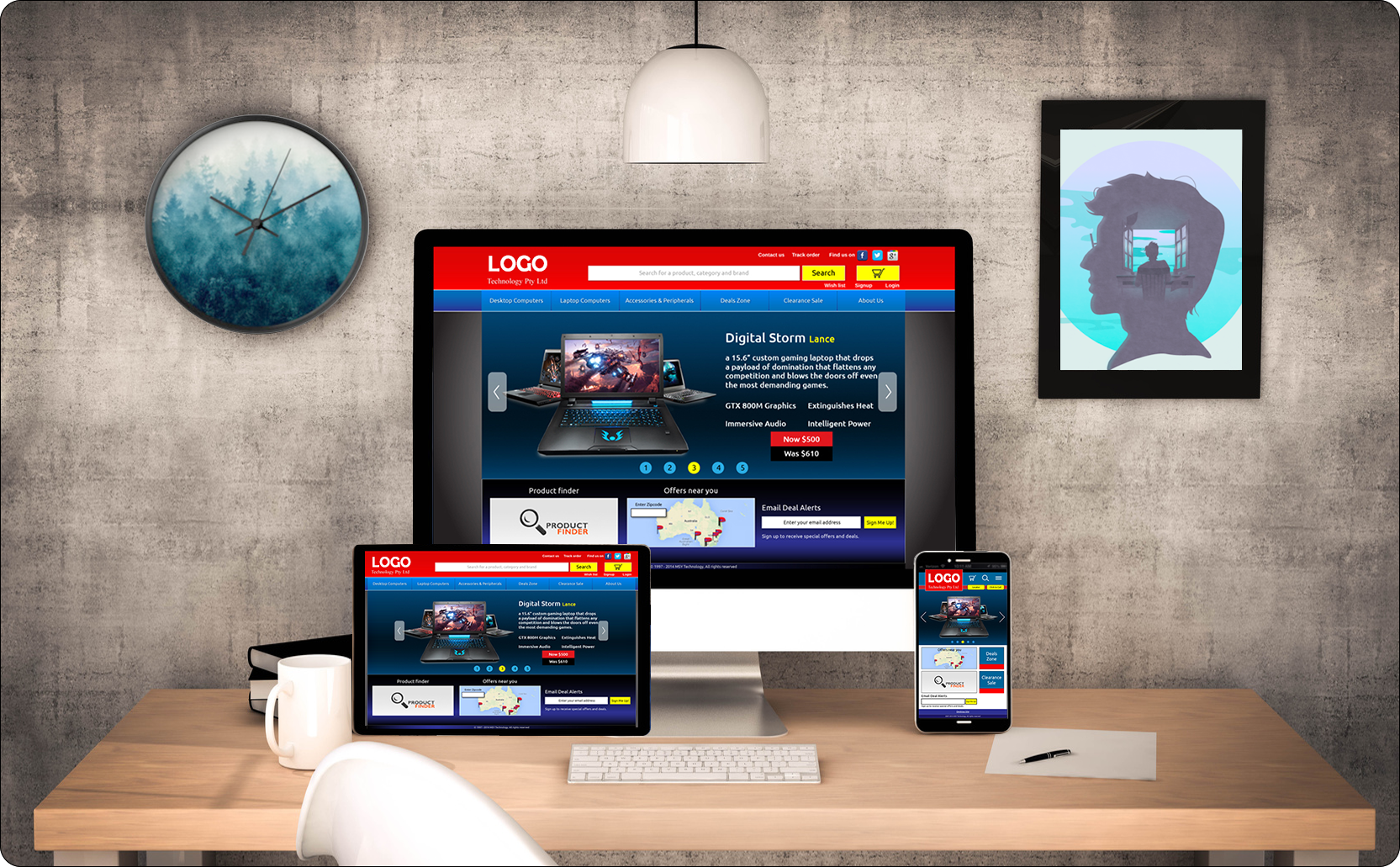
Responsive layout, desktop to mobile adaptation
Key Learnings
- Removing clutter is as important as adding design, negative space builds clarity
- Heuristic evaluation provides a structured, objective lens on usability problems
- Before/after comparison is the most compelling way to communicate design impact to stakeholders
Tools Used
Adobe PhotoshopAdobe IllustratorHeuristic EvaluationVisual DesignResponsive Layout